"
Communication is everyone's panacea for everything.
"
- Tom Peters
I was one of two UX designers and in charge of each of every screen in Messages applications. I conducted the following: Concept Development, Concept Visualization, User Research, Design Strategy, UX verification.
2014 - 2017
Galaxy S5 - 9
Galaxy Note 4 - 8
Galaxy Tab S, Galaxy Tab S2
Samsung Messages is one of the most basic features but also one of the most challenging applications to design in mobile phones. While GSMA (GSM Association) proposes technical standards to global mobile network operators, the specific specifications vary among different operators in the US, Europe, China, and else. As Samsung Mobile manufactures hundreds of different models every year, the company needs to unify different Messages UXs as much as possible among different specifications of different operators. Also, the software and UX need to be planned so that they are suitable for the unique UX of Galaxy. I took charge of designing the original UX of the Messages app in Galaxy mobile phones based on the analysis and understanding of users and specifications of different operators.
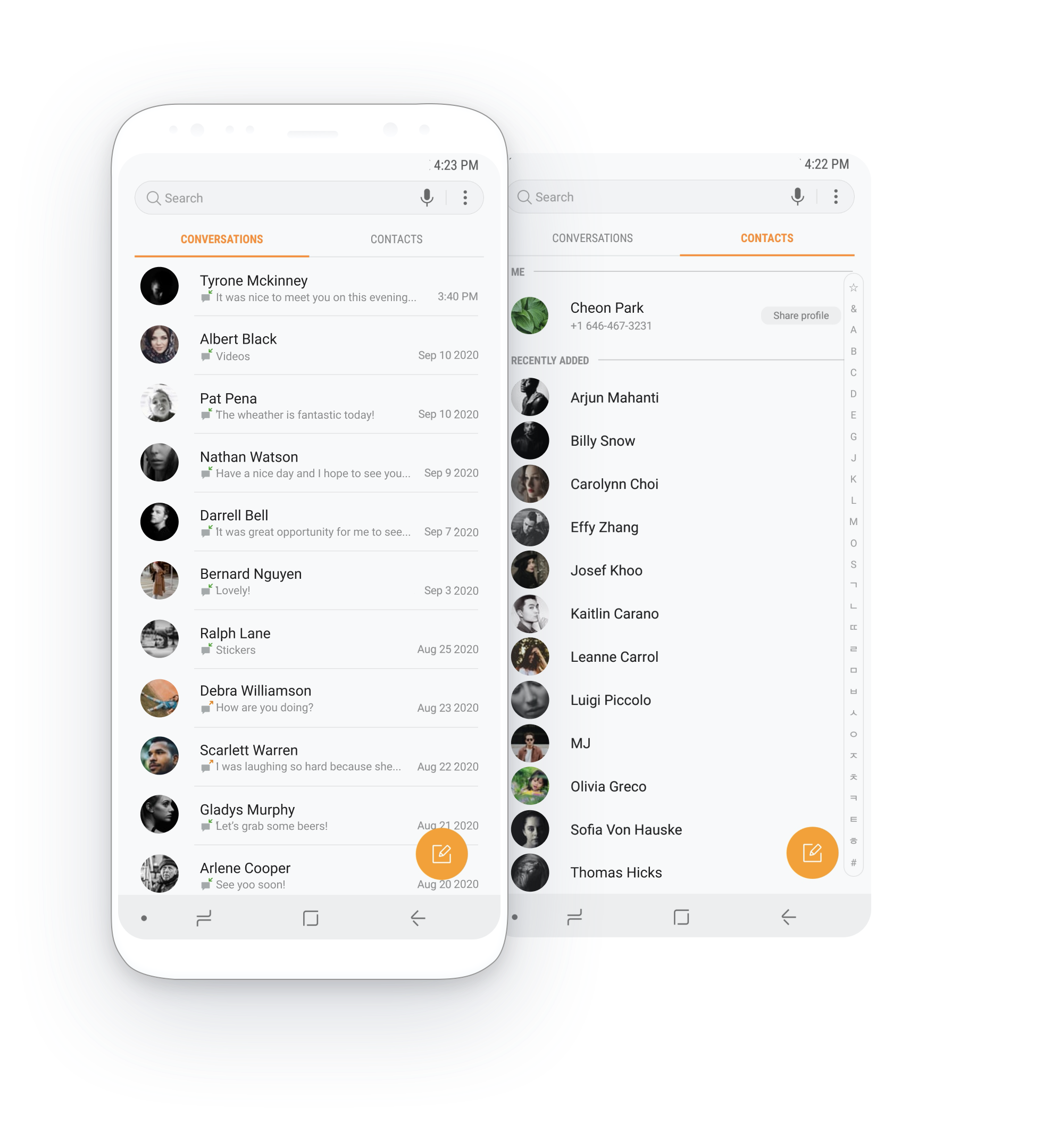
I took charge of each of every screen composing application, user-flows, notifications, localization, accessibility, and typing experience throughout the whole smartphone device. Below is the main screens forming the application.


I designed chatbot interactions from the entry point to actual conversation experience, including shopping, booking, paying, etc.

I integrated contacts to provide various entry points to composing messages, view contacts, and call.

I enhanced attachment experience due to customer’s needs for seamless interaction. The percentage of attaching photos are hugely increased and enabled users to communicate in various methods efficiently.

Enhanced messages is a service providing rich communication experience without any fee between Galaxy users. I unified the UX with SMS/MMS and instant messaging service, overcoming technological and specification restrictions.

I designed message bubbles for specific purposes due to contents type for intuitive experience.

Enhanced attachment experience due to customer’s needs for seamless interaction. The percentage of attaching photos are hugely increased and enabled users to communicate in various methods efficiently.

The previous menu structure for the conversation view was not suitable for messaging experience. I designed a menu tailored for the messaging experience.

Samsung Dex is a desktop experience when you dock your Galaxy to connect to a monitor. I dealt with not only mobile experience but also a desktop experience and keyboards.